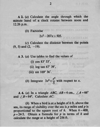
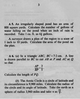
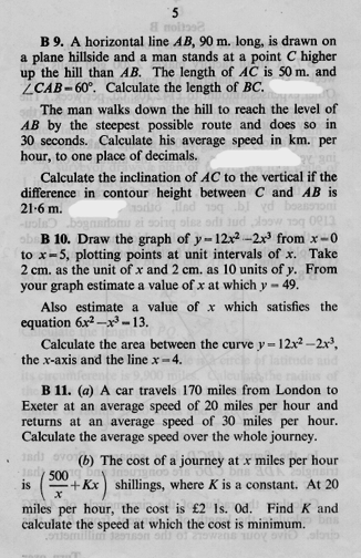
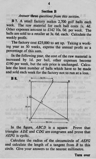
With all the furor about the dropping A-level and GCSE grades, it's interesting to take a look at what O level maths papers looked like in 1968. With the exception of integration and some outdated units, the material is actually broadly the same as what is included on a normal GCSE paper. However, I am struck by how much less user friendly the paper is.
Modern papers have white space, they ease students in by asking a few easy questions at the start, the numbers tend to be modestly sized integers, and diagrams are generally drawn for the student. Look at question B7 on the O level paper - you'd never find a huge block of text like that in a modern GCSE.
By comparison, I imagine this O level paper would look terrifying to most. I'm very tempted to have a few of my students try it.


